Pawn Pros: UI Design and Branding
Led the UI design and brand development for Pawn Pros, a Mexican pawn shop that needed a digital platform. The project involved creating a cohesive visual identity, including typography, color palette, and brand guidelines. Additionally, I designed the website interface and collaborated closely with a web developer to ensure accurate implementation and visual consistency across the platform.
My role:
UI Designer, Low and High Fidelity Design, Prototyping, Usability Testing, Branding.
What I did:
- Brand manual design
- Full brand package
- Sketching & prototyping
- Low fidelity and High fidelity design
- User testing
Toolkit:
Branding
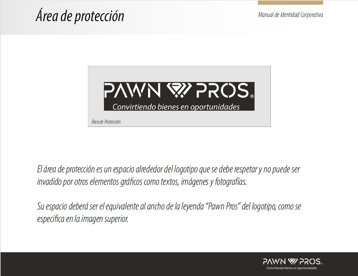
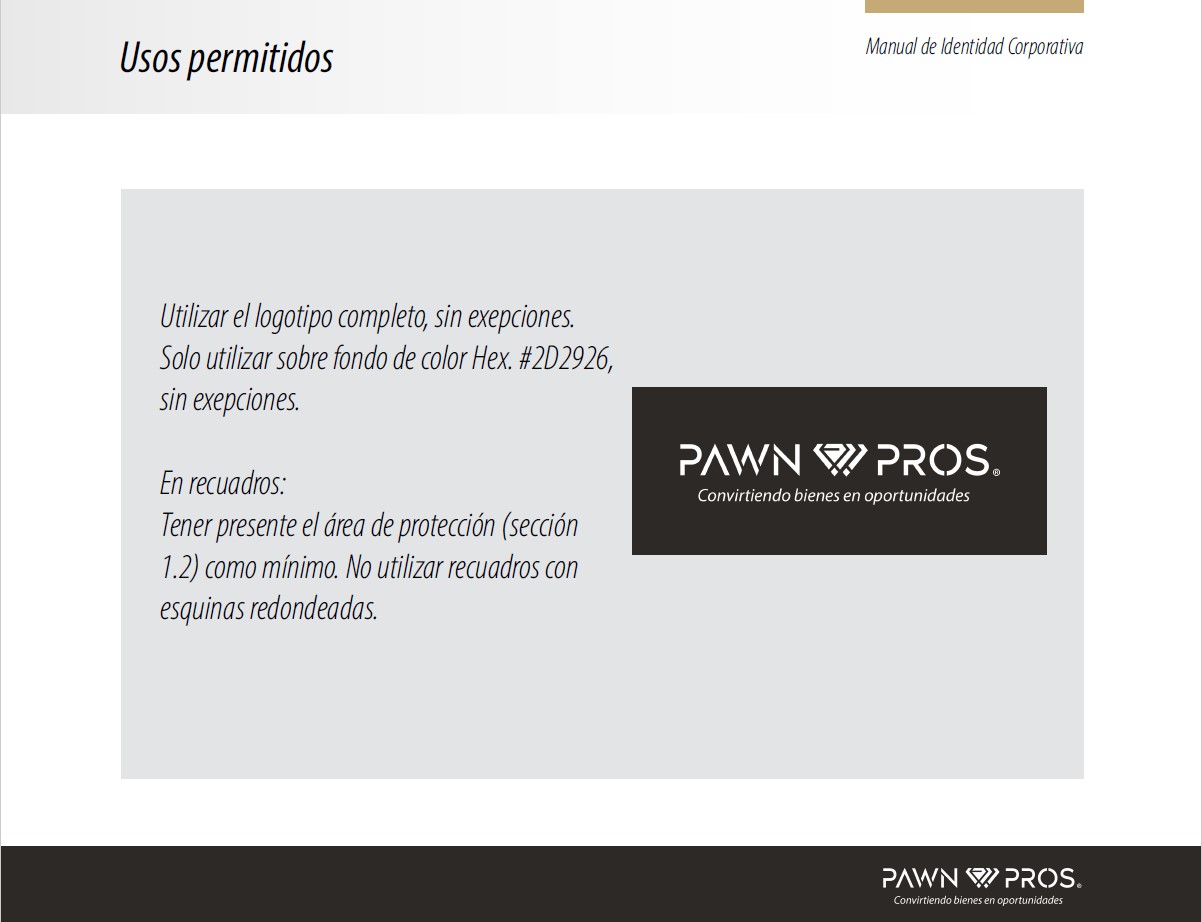
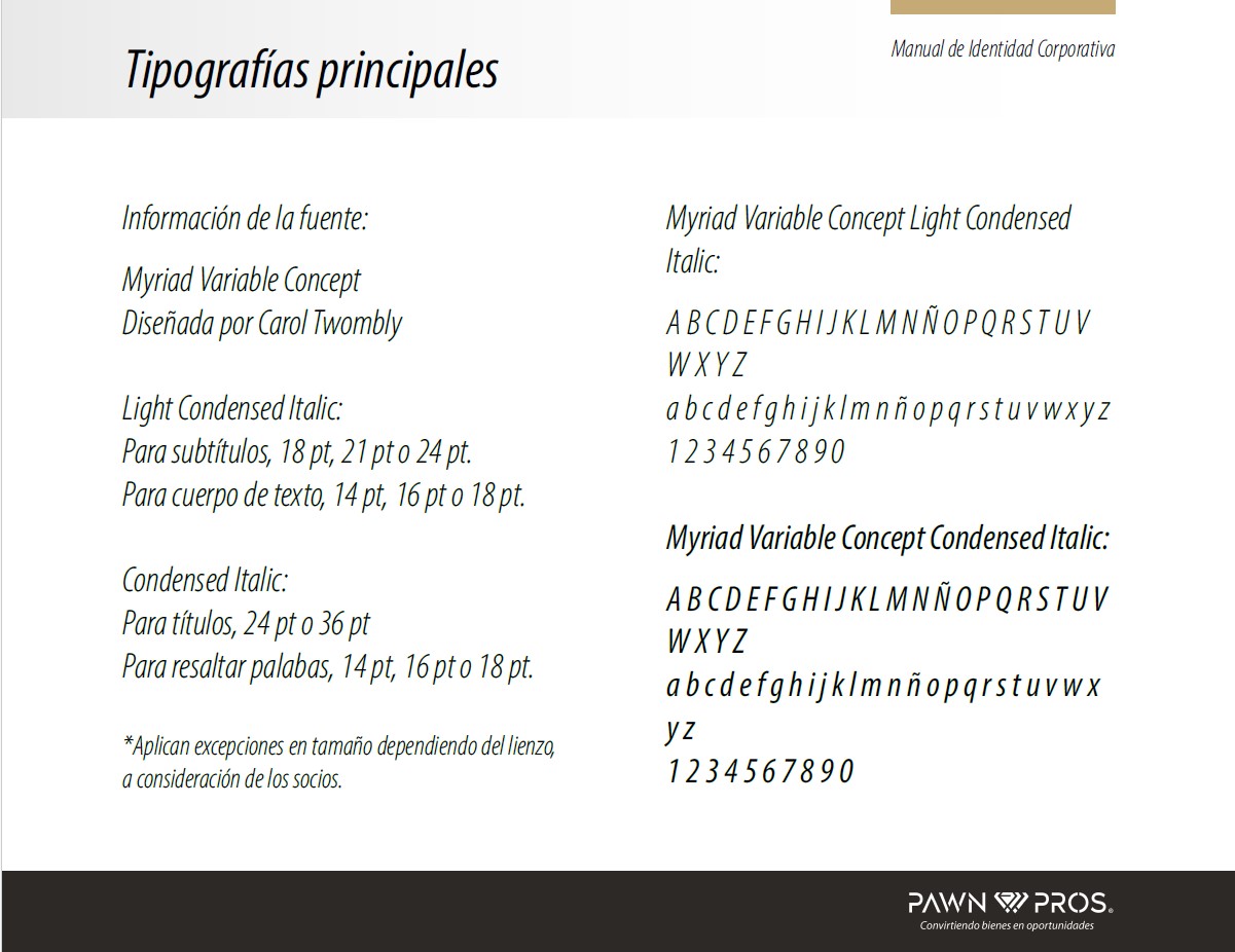
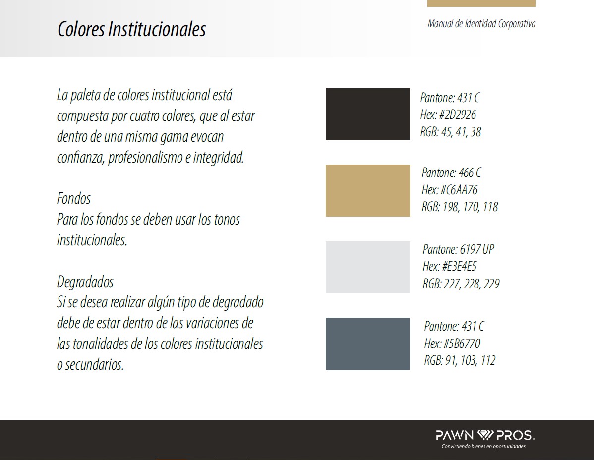
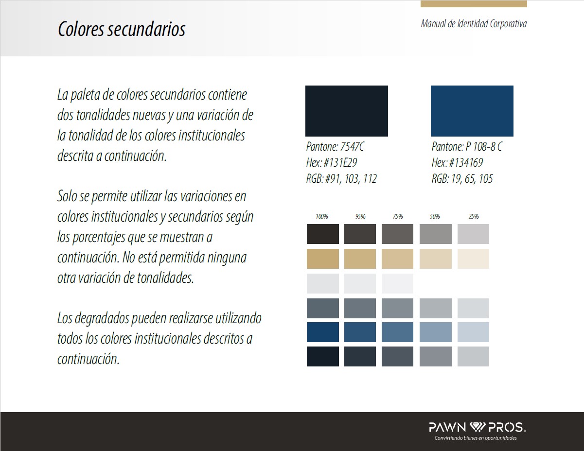
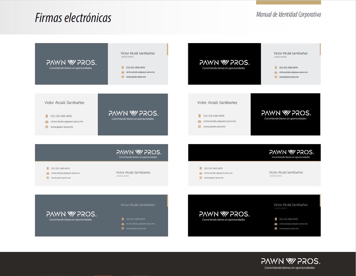
As part of the visual identity development, I created a complete brand manual that established the visual tone for Pawn Pros. This included logo usability, color palette, typography guidelines, and sample imagery. The final deliverables were packaged with font files, logo variations, and visual assets ready for both digital and print applications.
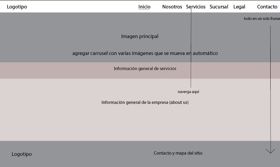
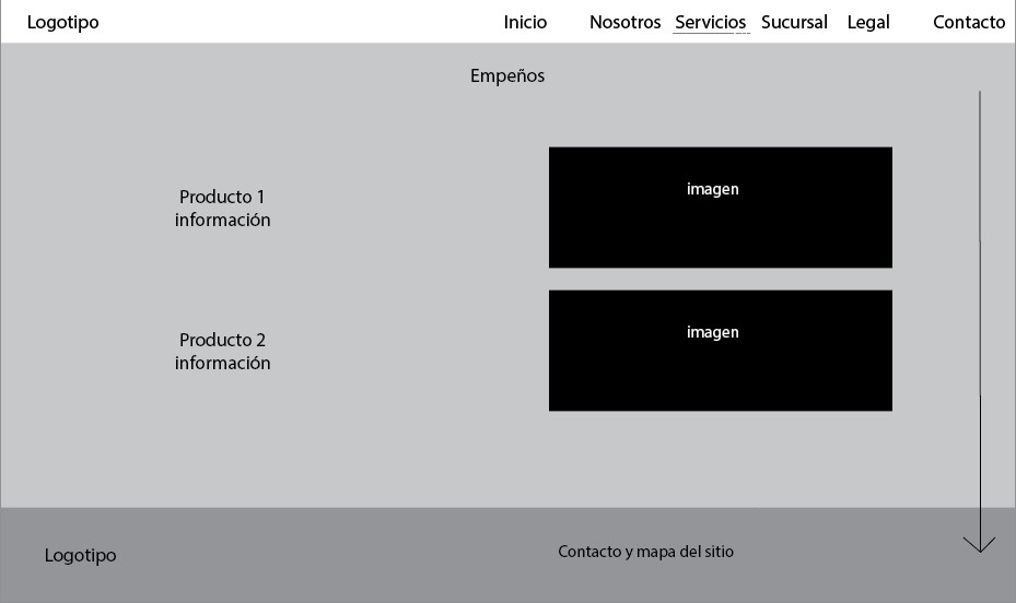
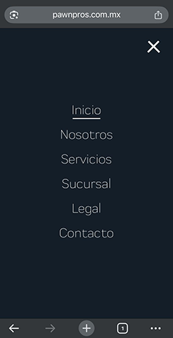
Low-Fidelity Wireframes
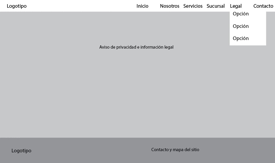
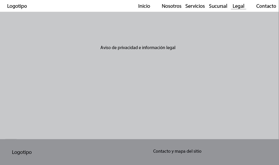
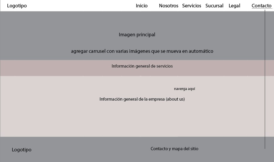
The project began with low-fidelity wireframes created with Illustrator to define the site’s overall layout, structure, and content distribution. This stage helped align expectations with the client, who requested several changes, including additional navigation tabs and content adjustments.
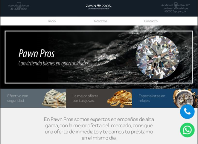
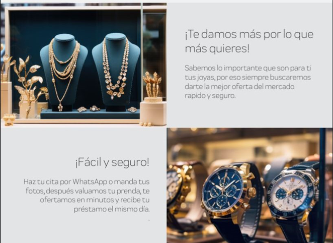
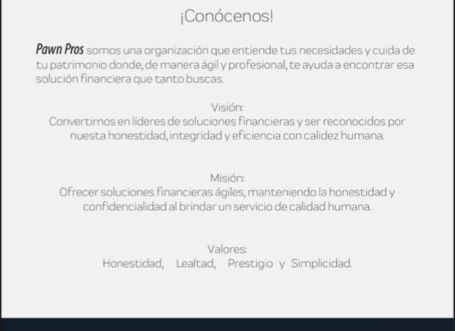
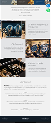
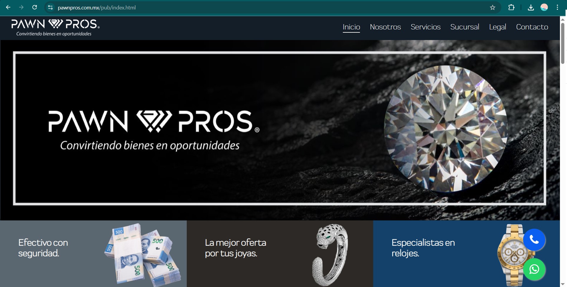
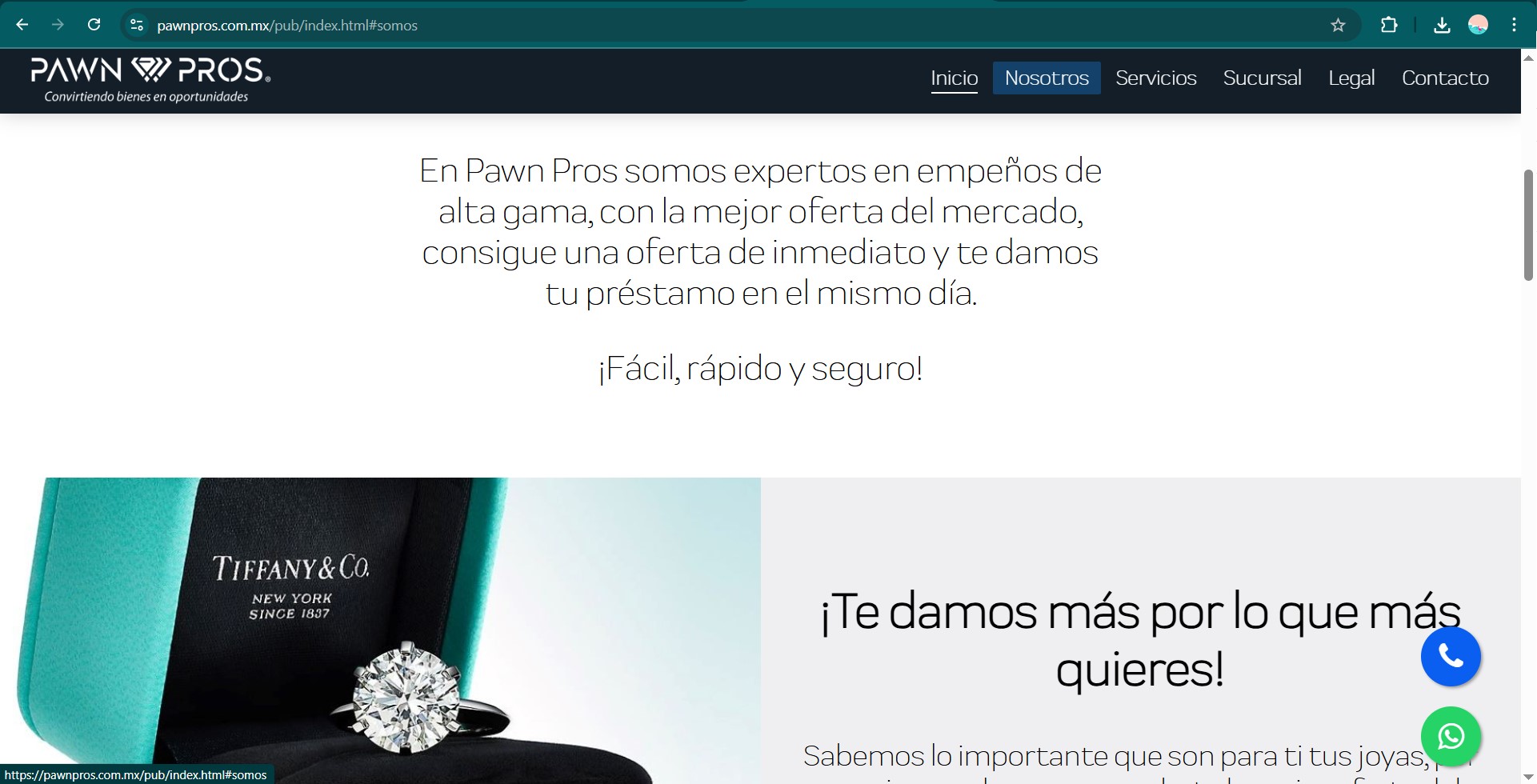
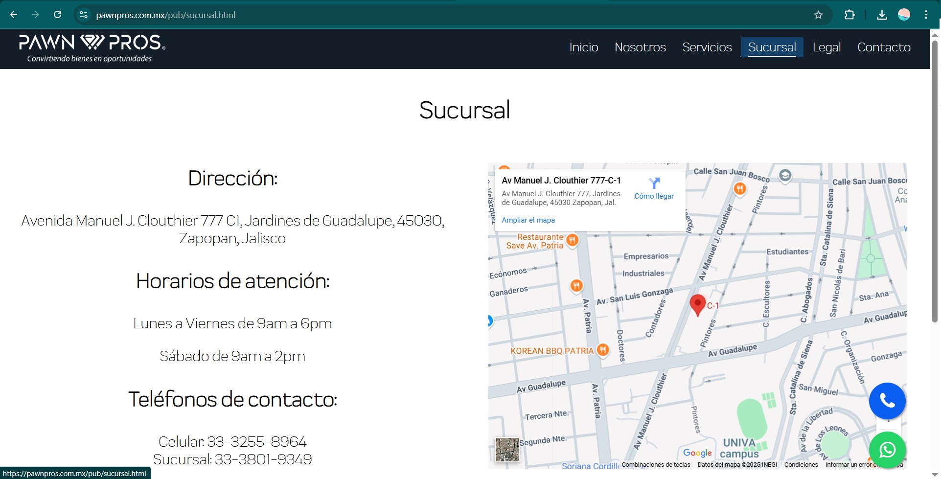
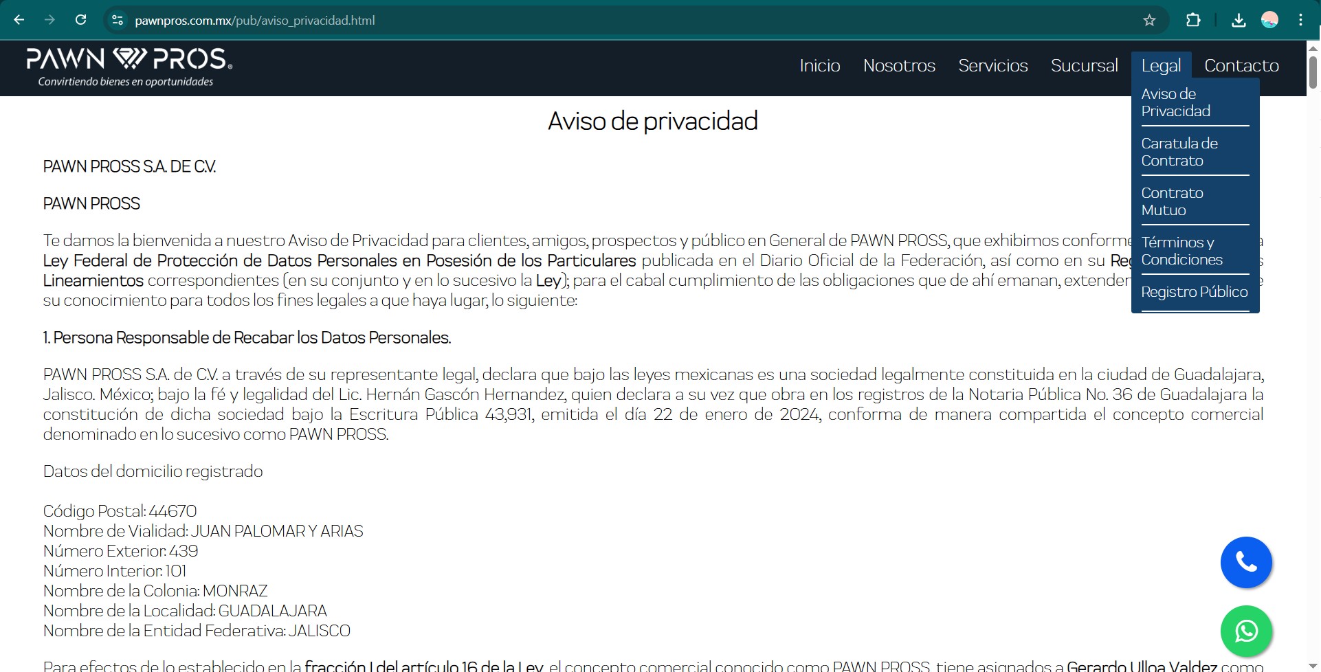
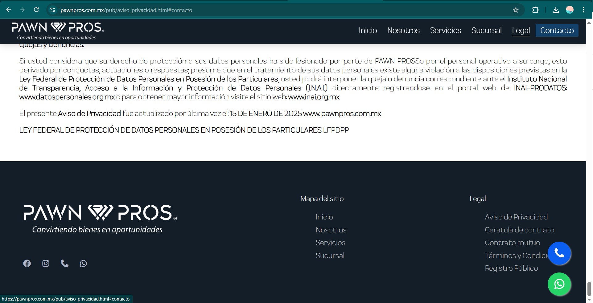
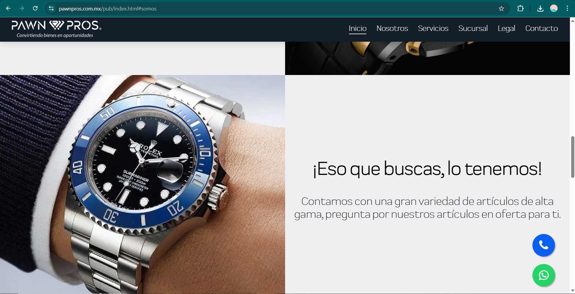
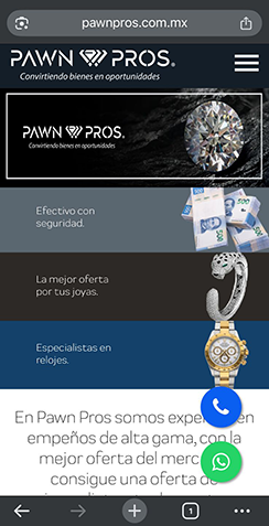
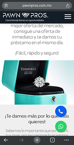
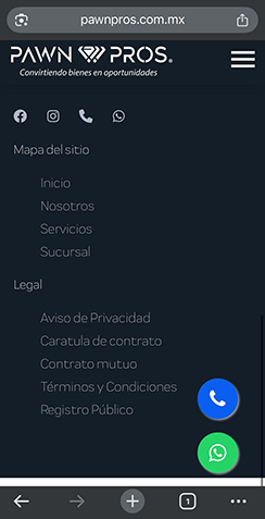
High-Fidelity Design
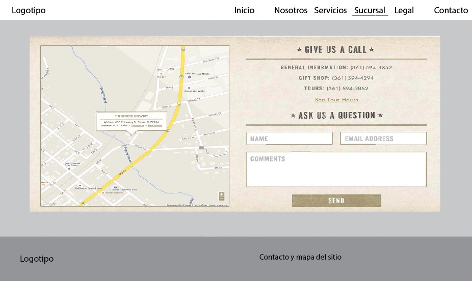
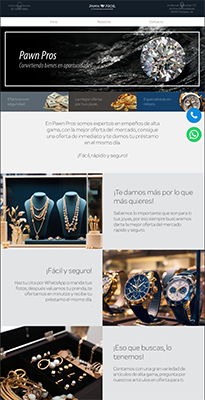
Using the brand manual I previously developed, I created high-fidelity mockups in Figma for both desktop and mobile views. This step focused on applying the visual identity consistently, ensuring strong hierarchy, legibility, and a user-centered layout.
User Testing
To validate the functionality and ease of navigation of the website prototype, a small usability test was conducted with three participants who matched the expected user profile (participants were chosen by the customer). The testing was carried out remotely using the interactive Figma prototype.
Participants were asked to:
- Open the platform in web and mobile versions
- Navigate from homepage to Services page
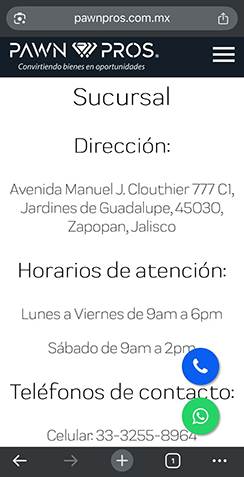
- Locate contact information and opening hours
- Identify where to submit a request
- Provide overall feedback on clarity and navigation
Metrics:
- Task success rate
- Time on task
- Click count per task
- Navigation path
- Areas of confusion
Results:
Task success rate of 100% for finding contact form and 66% for service navigation. Average time to complete tasks: 30 seconds. Most common issue was that one user struggled to locate the contact information as mistaking it with the location. The upper menu was redesigned next to the logo, the contact information was changed to the bottom of the screen and some other visual changes were made following the client’s feedback.
Handoff to Development
I collaborated with a web developer who handled the implementation phase. While I was not directly involved in coding, I ensured that design assets and specifications were delivered for an accurate build.
Conclusion
This project successfully delivered a cohesive visual identity and a responsive website aligned with the client’s goals and expectations. From brand definition to user interface design and final implementation, every stage was guided by usability principles and collaborative feedback.