Internal OPR Tool: UX/UI Overhaul
Internal operations tool designed specifically for BU leaders to streamline access to key reports, dashboards, and strategic insights. Focused on centralizing resources, and improving decision-making efficiency across business units.
Developed by a team, this case focuses on ownership of UX /UI design, user testing, data collection, design iteration, and branding.
My role:
UX /UI Designer, Research, Low and High Fidelity Design, Prototyping, Usability Testing, Data management.
What I did:
- Research
- Data processing, analysis and filtering
- User flow
- Sketching & prototyping
- Low fidelity and High fidelity design
Toolkit:
Research & Discovery
Given the limited availability of executive users, direct research was not feasible for this project. Instead, the discovery phase relied on internal discussions, previous feedback, expert assumptions, and needs based on existing processes. I created user personas and a customer journey map grounded in these insights to visualize pain points, expectations, and decision-making patterns typical of high-level stakeholders. These tools helped guide the design toward a solution that prioritized clarity, efficiency, and minimal cognitive load for leadership profiles.
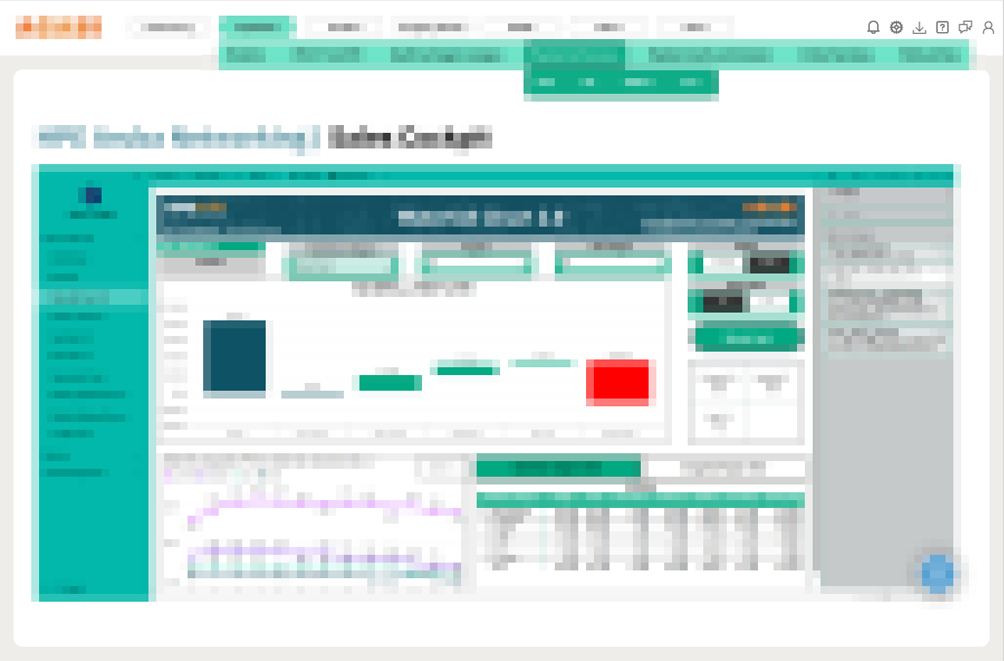
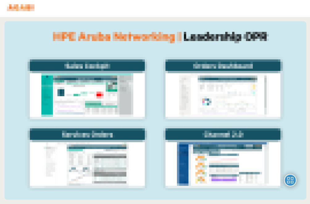
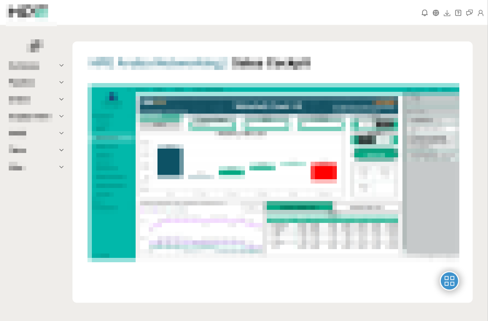
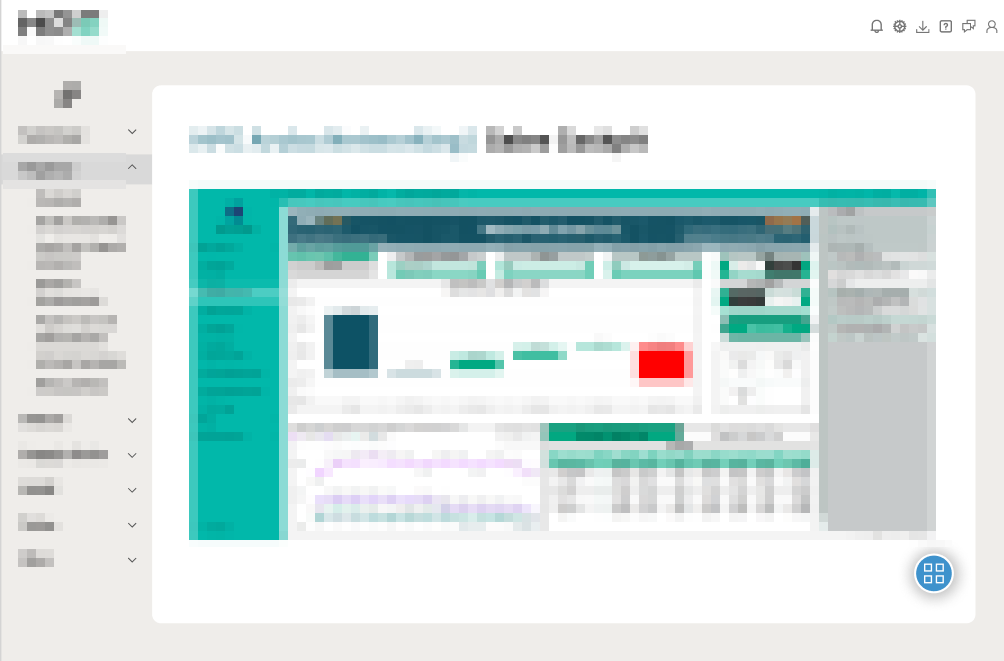
Due to confidentiality agreements, most visual assets cannot be shared externally. However, a selection of approved materials is included below.
Persona:
To guide the design process, I first developed two user personas representing key executive stakeholders. These personas helped clarify user goals, pain points, and behavioral patterns within the context of an internal operations tool.
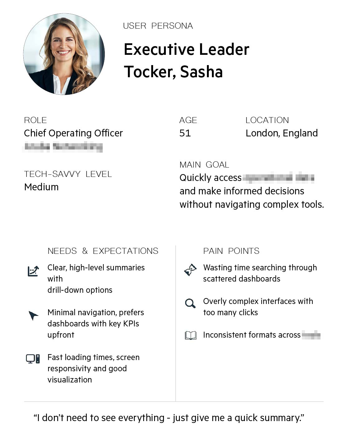
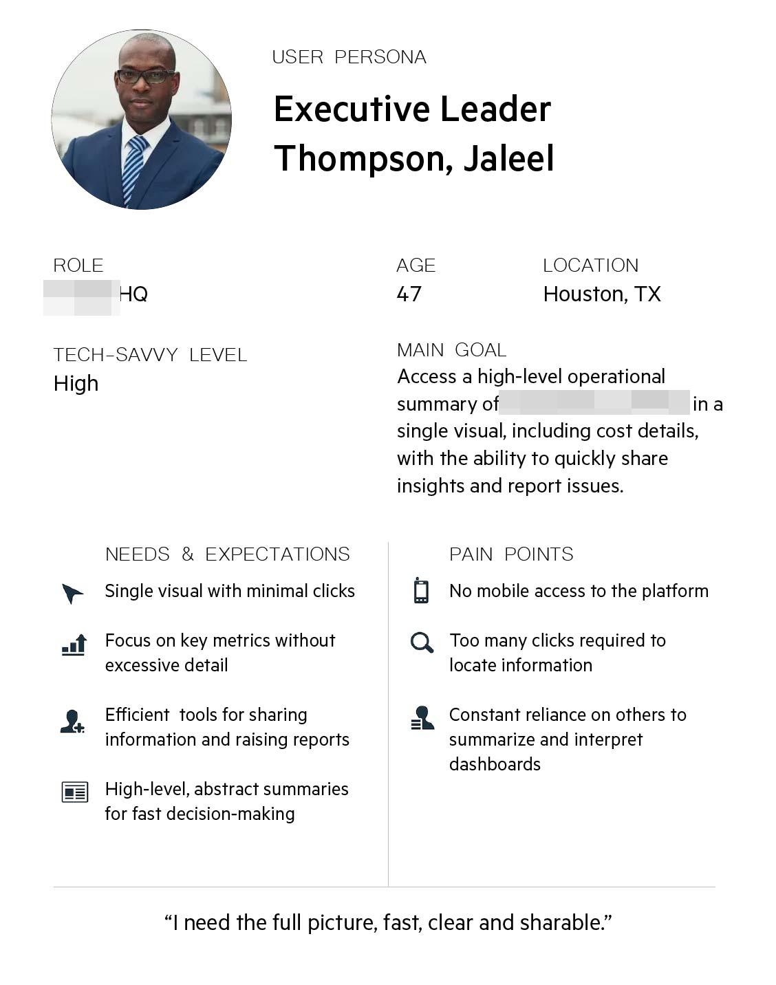
Key observations:
- Time is limited: both users operate in high-pressure, decision-making roles. They need information fast.
- Summarized data is critical: neither user wants to interpret complex data.
- Mobil access is non-negotiable.
- Information should be actionable: ability to quickly share, comment or escalate insights.
Average Client Profile:
A senior executive between the ages of 45 and 55, with medium to high tech proficiency, responsible for overseeing operations or strategy across business units. This user seeks fast, centralized access to high-level operational summaries — particularly KPIs and cost metrics — without having to navigate complex interfaces or multiple tools. They value minimal navigation, clear and responsive dashboards, and tools that allow them to quickly share information, raise reports, or make decisions.
User Flow
Based on these insights, I mapped out the general user flow to ensure the platform offered a streamlined, task-oriented experience aligned with leadership expectations and time constraints.
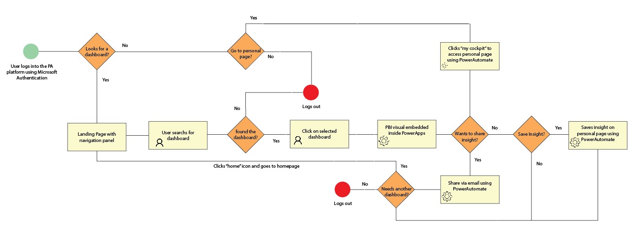
Key observations:
- Efficiency: steps must be minimized. If the user does not find information fast = abandonment.
- Home screen is a strategic point: a clear well-prioritized landing page with all information available.
- Direct access to dashboards is essential: pre-filtered views by role or BU.
- Integrate Power Automate: automating sharing, reporting and submissions.
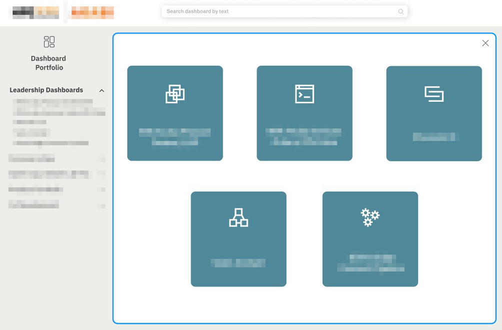
Design and prototype:
The design process started with wire frames created in Figma, focusing on layout structure, information hierarchy, and early interaction logic. These helped align the design direction with user expectations. Minor changes were made after team’s feedback. The final Figma prototype was used for user testing and stakeholder feedback, serving as the foundation for the implementation phase.
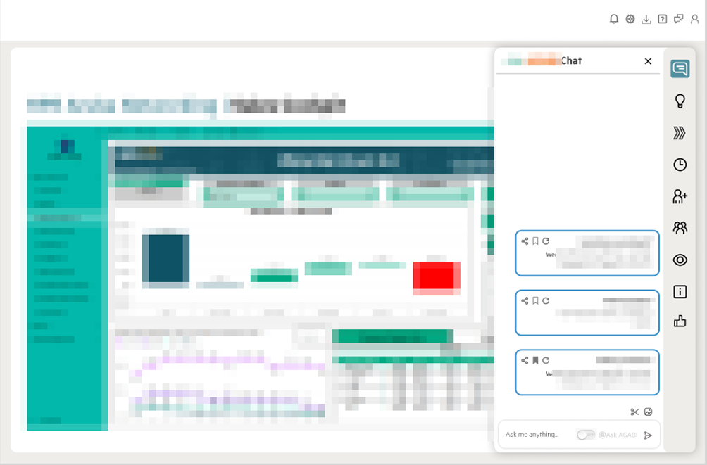
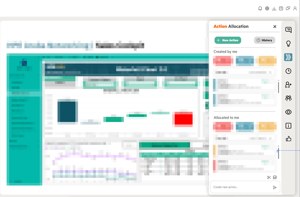
Disclaimer: While visual examples are included to illustrate design decisions and layout structure, most content has been blurred in accordance with internal confidentiality policies.
Usability Testing
Due to time constraints and limited availability, usability testing was conducted with two executive stakeholders from the target user group.
Participants were asked to:
- Open three different dashboards
- Go to personal cockpit space
- Sharing a report
- Submitting a request through the platform
Findings:
- Both participants completed all assigned tasks without external help.
- The homepage was perceived as clear and easy to navigate.
- Both participants suggested menu to be vertical.
- Both users appreciated visual clarity and minimal steps required to access data.
- There was no need for mobile version.
Final Design
Conclusion
This project delivered a streamlined internal tool tailored to the needs of executive users, balancing efficiency, clarity, and accessibility. Despite research and testing limitations, key design decisions were informed by well-structured assumptions, targeted feedback, and user validation. The final solution integrates seamlessly with existing tools and supports leadership in accessing, sharing, and acting on operational data more effectively.