Dashboard Portal: UX/UI Design & Development
Dashboard portal redesign created to improve access to internal key information by simplifying navigation and centralizing content. The original version, built with standard SharePoint components, required users to click through multiple pages to locate key resources. The new design fo cuses on re ducing friction, streamlining information access, and improving the overall user experience.
My role:
UX /UI Designer, Research, Low and High Fidelity Design, Prototyping, Usability Testing, Data management, and Platform development.
What I did:
- UX evaluation
- UX /UI redesign
- Data management
- Low and High fidelity design
- Testing
- Development and implementation
Toolkit:
Research & Discovery
The project began with an evaluation of the existing dashboard portal, which had been built entirely using native SharePoint components. While functional, the original setup lacked flexibility and did not support a user-friendly experience.
While the full interview data cannot be shared due to confidentiality agreements, I conducted ten structured interviews via Microsoft Forms, and three informal user interviews to understand key pain points in the original portal. In addition, usage observations and internal feedback helped identify key usability pain points, outlined below.
1. The experience was too fragmented, leading to cognitive fatigue.
Users had to jump between too many disconnected pages to complete simple tasks. This not only made the experience inefficient, but also mentally exhausting, especially when trying to locate dashboards or return to the homepage after an error.
Impact: Increased user frustration, reduced efficiency, and lower adoption over time.
2. Visual design was overpowering functionality.
Over-sized images and visuals compromise d usability by pushing important content further down or out of view. This reduced scannability and slowed users down.
Impact: The UI was aesthetically present but not purposeful, negatively affecting task speed and clarity.
3. Performance bottlenecks amplified friction
An average of 32 seconds per task — largely due to slow page loads and inefficient navigation — is significant for frequent-use platforms.
Impact: Users lost trust in the system’s responsiveness and were discouraged from self-service behaviors.
4. Information architecture failed to match user intent
Even though users valued dashboard summaries, the lack of a quick access option created an unnecessary barrier.
Insight: Users want both : context + speed — and the old system forced them to choose one or the other.
Impact: This design misalignment slowed down decision-making and increased frustration.
UX/UI Strategy
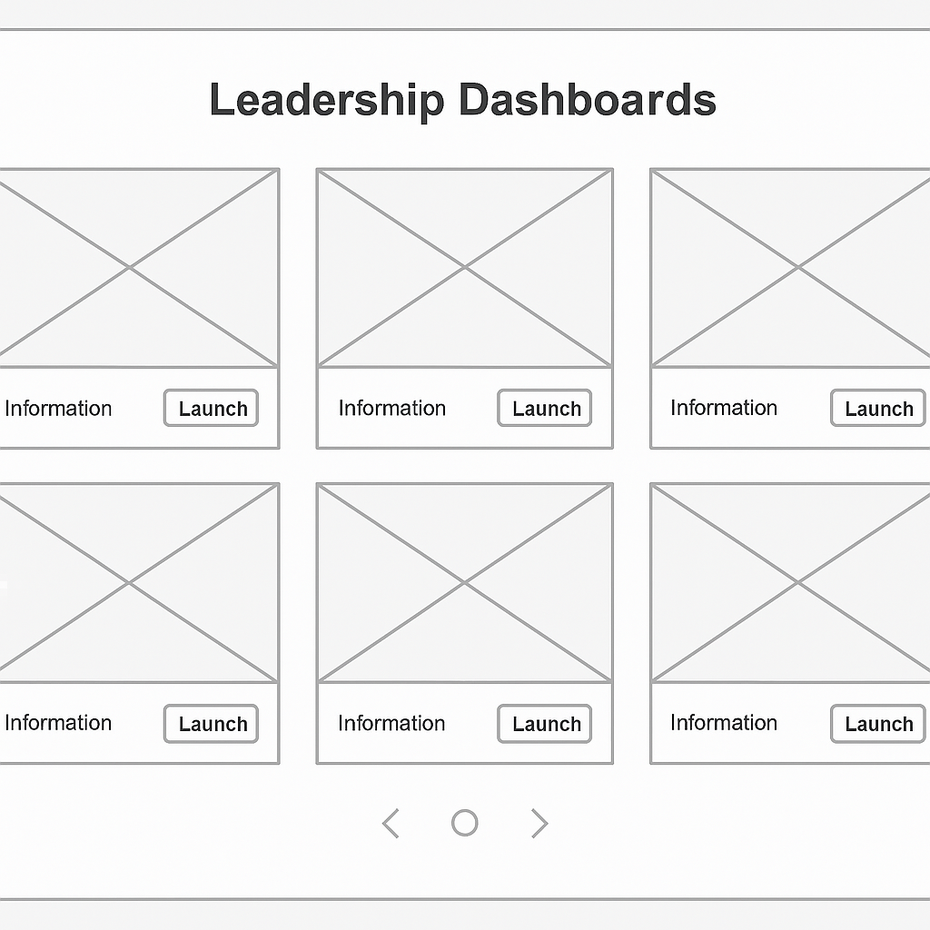
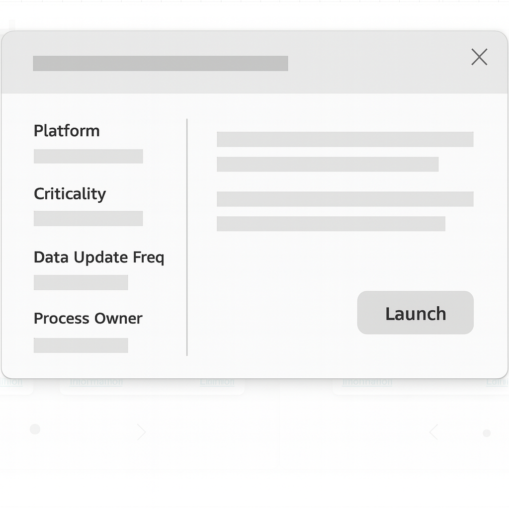
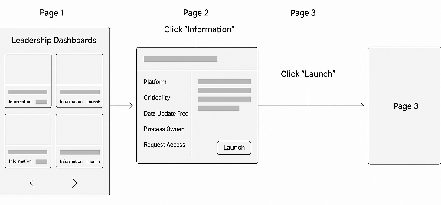
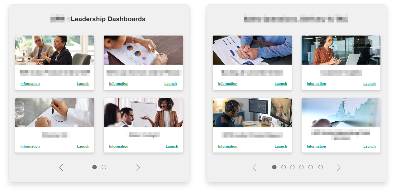
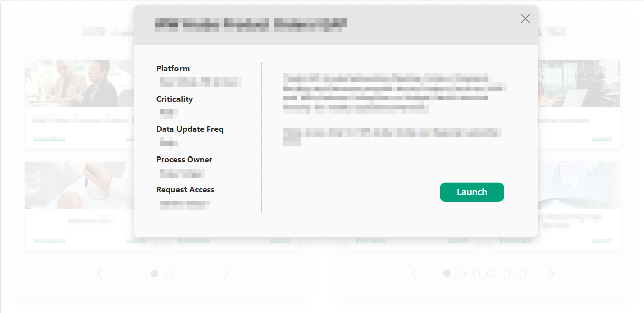
To address the platform’s main usability issues, I designed a simplified one-page layout with anchor-based navigation, reducing the number of clicks and improving content findability. Visuals were resized for better clarity, and direct access to dashboards was added to streamline task completion. The goal was to create a clean, intuitive interface that feels fast, centralized, and easy to use.
Low Fidelity Design

A/B Testing
Testing was conducted with 3 participants, all asked to interact with both platforms; the existing one and the Figma’s low-fidelity design.
Participants were asked to:
- Open the platform.
- Find a dashboard.
- Access the dashboard's key information.
- Launch the dashboard.
- Return to homepage.
Metrics:
- Interaction time.
- Time per task.
- Success rate.
- Level of satisfaction (SUS scale).
Results:
Interaction time was reduced by an average of 40% on the new platform, time per task dropped from 32 seconds to 19 seconds on average. Success rate was 100% on b oth platforms, but SUS system changed form C to A in the new platform. Minor changes were made, adapting the platform from 3 to 2 pages and dividing the portfolio into two main sections.
Final Design and Development
Since we didn’t have a dedicated developer, I led the end-to-end implementation using PowerApps, one of the few approved internal tools available to ensure we could deliver a functional and scalable solution within our constraints.


Conclusion
This project demonstrates a full-cycle UX /UI redesign, addressing major usability challenges in the original SharePoint-based portal. Through UX /UI research and design, I created a centralized, intuitive dashboard experience that significantly improved navigation and task efficiency.
While the project was successfully implemented and well-received, it also sparked internal conversations about the need to redesign the full team’s platform. As the organization continues to evolve, this solution may serve as the foundation for future iterations and broader improvements across internal tools.