Communications Portal: UX/UI Optimization
Centralized hub for internal communications, managing end-to-end UX/UI design, creation, and implementation, including user research, design system creation, and internal testing.
Although the need for a redesign of the team's platform was evident, the limitations of the existing interface made it very difficult to deliver an optimal user experience. Based on this feedback and an evaluation of the available internal development tools, a full platform redesign and a user research plan were approved.
My role:
UX/UI Designer, Research, Ideation, Wireframes, Low and High Fidelity Design, Prototyping, Usability Testing, creation and implementation of the platform.
What I did:
- Primary research
- Data processing, analysis, and filtering
- User flow
- Sketching & prototyping
- Low fidelity and High fidelity design
- User testing
- Platform development & launch
Toolkit:
Research & Discovery
To understand user needs and pain points, I conducted stakeeholder interviews and quickuser surveys across different roles via Microsoft Teams and Microsoft forms. This phase help me define core use cases, prioritize features, and inform the overall structure of the portal.
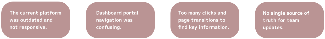
Key findings revealed:
User Flow
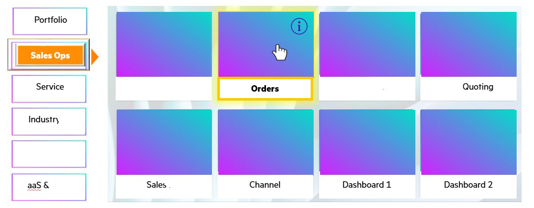
I mapped out the current platform’s user flow to have a better understanding of the principal difficulties a common user faces when entering the platform and accessing the team’s information.
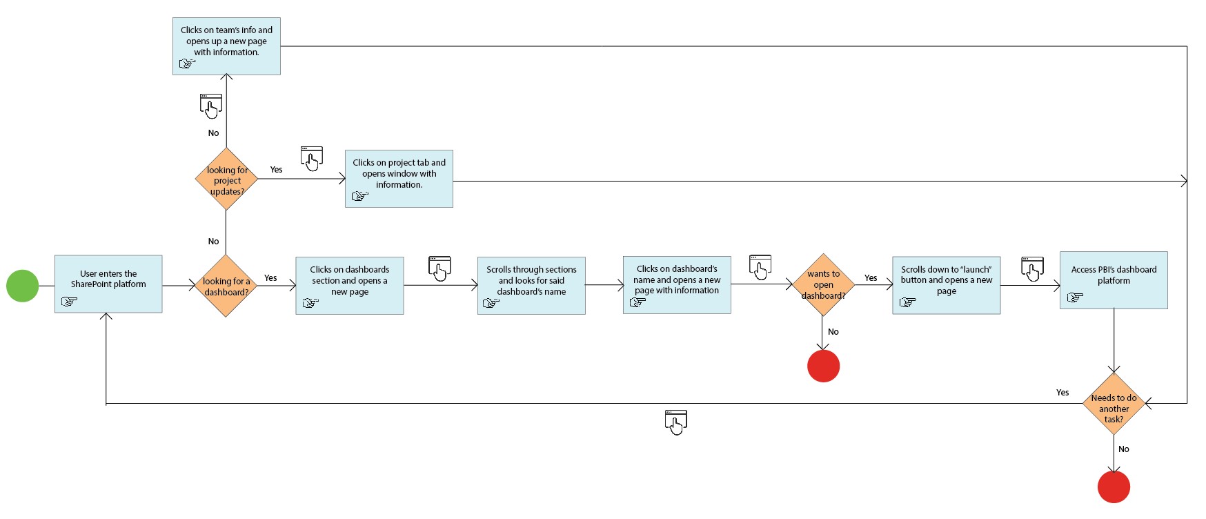
Due to confidentiality agreements, user personas are not available for external sharing. Key observations are listed below:
- Too many clicks: users need to open lots of pages to access key information.
- Clear and simple language: less text, avoid complex terms, easy to comprehend structure.
- Design for mobile device: mobile-friendly site since leaders often access using smartphones.
- Intuitive navigation: organize menus and links per BU or structure so users can find key information.
- Guidelines: on-brand fonts and colors.
- Consistent design elements: uniformity in colors, icons, images, and layouts throughout the platform.
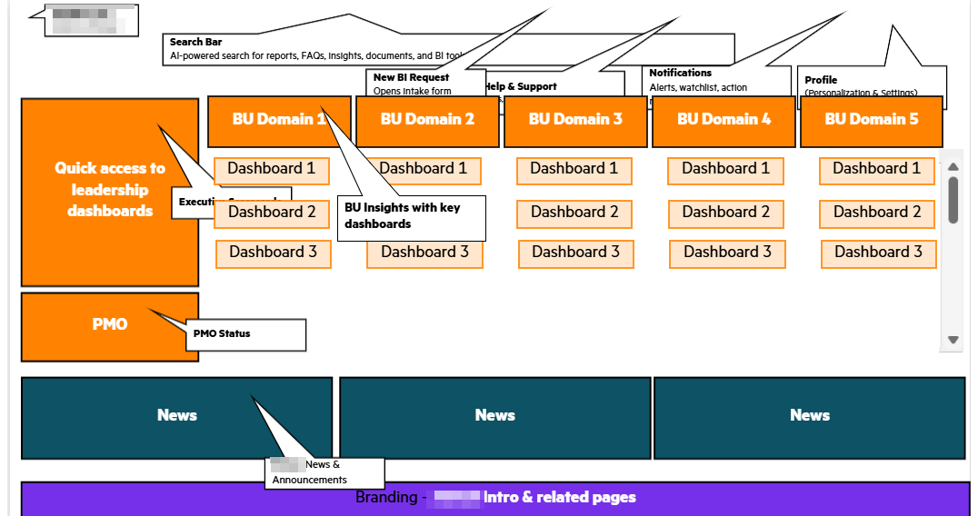
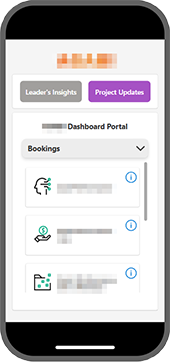
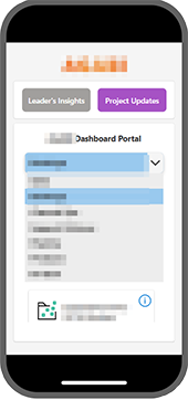
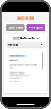
Low and High Fidelity Design and Prototype
The prototyping process began with low-fi delity wireframes created in Adobe Illustrator to quickly explore layout and structure. Once the visual direction was defined, high-fidelity designs were developed using Adobe Photoshop and Figma. The final Figma prototype included interactive fl ows and was u se d for user testing to validate usability and gather actionable feedback.
Usability Testing
Testing was conducted with 4 participants, three of them concurrent users of the application and the last one a brand new user.
Participants were asked to:
- Open the platform in web and mobile versions.
- Access and navigate through project updates.
- Find X dashboard.
- Find specific information about X dashboard.
- Save links and share insisghts with collages.
Metrics:
- Change dashboard's grouping for better understanding.
- Add direct links to each dashboard before accessing the "info" part.
- Change color palette to avoid eye strain.
A/B Testing
A platform was already in place (unable to share due to confidentiality agreements), but users were not engaging with it due to difficulty finding information. The redesign focuses on visual hierarchy, simplifying metrics and improving navigation.
Testing was conducted with 8 participants, four of them interacted with the current platform and the rest with the new one.
Participants were asked to:
- Open the platform in web and mobile version.
- Find X dashboard.
- Access X dashboard's key information.
- Open X dashboard (external PBI link).
- Return to the platform.
- Return to homepage.
- Find the team's project updates.
Metrics:
- Average interaction time.
- Average time per task.
- Success rate (tasks completed).
- Level of satisfaction (SUS scale).
Results:
33% reduction in average interaction time, 45% reduction in average time per task, in both platforms the success rate was 100%, SUS scale from 61/100 to 88/100. The new design outperformed the current one, its implementation was approved based on improved efficiency, comprehension and overall usability satisfaction.
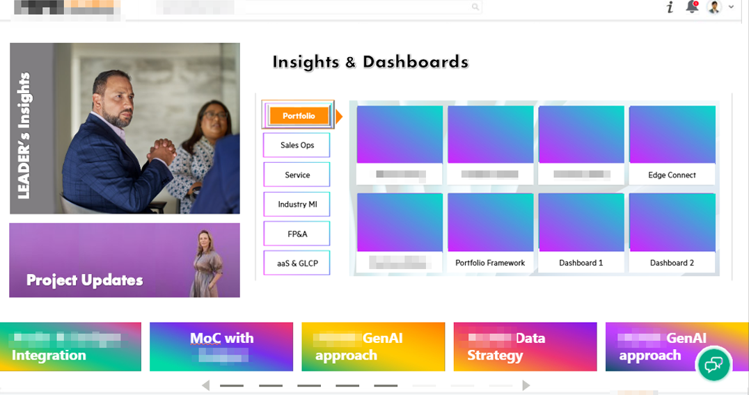
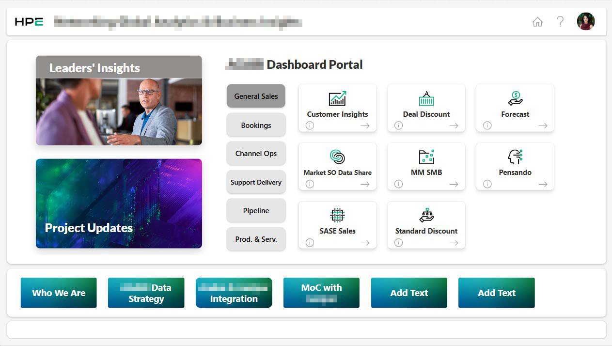
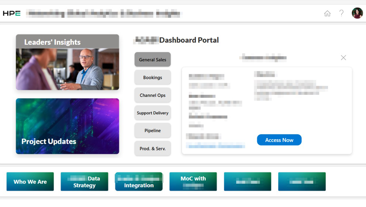
Final Design and Development
Following user testing, the final designs were built in Figma for both web and mobile versions. I led the development process using Power Apps and Power Automate for interface and workflows, and Sharepoint to manage the platform’s data structure. Once finalized, it was reviewed with the senior leadership team and successfully launched.
Conclusion
The redesign of the internal communications portal successfully addressed key usability issues and is now fully implemented across the organization. It has improved access to information and enhanced the overall user experience for all team members.